[Cross-posted with scholarslab.org]
Out of the box, Neatline (our recently-released framework for building geotemporal exhibits) can be used to create geo-temporal exhibits based on “modern-geography” base-layers – OpenStreetMap, Google satellite and street maps, and a collection of beautiful, stylized layers from Stamen Design. For historical and literary projects, though, one of Neatline’s most powerful features is its deep integration with Geoserver, an open-source geospatial server that can pipe georeferenced historical maps directly into Neatline exhibits. For some examples of this, check out these four demo exhibits built on Civil War battle maps by Jedediah Hotchkiss.
Geoserver is a pretty complex piece of software, and the process of assigning geographic coordinates to static image files (called “georeferencing” or “georectifying”) can be a bit tricky at first. This is the first post in a three-part series that will walk through the entire process of rectifying a historical map using ArcMap, post-processing the image, uploading it to Geoserver, and importing the final web map service into a Neatline exhibit.
Georectification
To start, all you need is a static image file that can be positioned in some way or another on top of a real-geography base layer. Usually, this is a map of some sort, but it could also be aerial photography, or, in more experimental and interpretive use-cases, it could even be a totally non-geographic image that would gain some kind of meaning from being situated in a geospatial context (for example, see the georeferenced manuscript pages in the “My Dear Little Nelly” exhibit).
Since the final map will be presented in an interactive environment that lets the user zoom in and out at will, it’s best to try to find a high-resolution version of the image you want to work with, which will make it possible to zoom further in before the image starts to noticeably pixelate. That said, the images don’t need to be excessively large – as Kelly Johnston (one of the GIS specialists in the Scholars’ Lab) pointed out, extremely high-fidelity images (~10,000 pixels in height or width) often don’t really provide that much more value than somewhat smaller images, and can have the effect of choking up Geoserver and slowing down the speed with which the map is rendered in the final Neatline exhibit. For historical and literary use cases, I’ve found that images with dimensions in the 3000-5000 pixel range provide a good balance of resolution and speed.
In this tutorial, I’ll be working with map #124 in the Hotchkiss Map Collection at the Library of Congress (see the full list of maps here). To get the static image file, go to the view page for the map and right click on the “Download JPEG2000 image” link at the bottom of the screen and click “Save Link As…”
With the image in hand, let’s fire up ArcMap and get the environment set up:
-
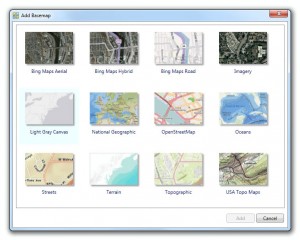
Add a base map by clicking on
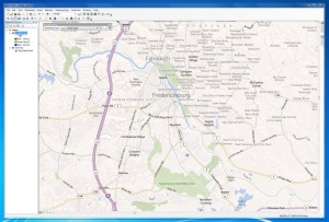
File > Add Data > Add Basemap. The base map is the real-geography foundation, the “true” map against which the image will be referenced. Select one of the nine options and click “Add.” This is largely just a matter of preference. For for maps with a lot of human geography (roads, railroads, cities), I like the “Bing Maps Road” layer, and for maps with natural geography (rivers, mountains, coastlines) I like the “USA Topo Maps” layer. After you’ve added a base map, a listing the layer will appear in the “Table of Contents” column on the left, which lists out all of the assets available in the environment. You can toggle layers on and off by clicking the checkbox next to the layer title. -
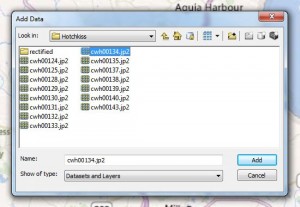
Add the static image that you want rectify by clicking on
File > Add Data > Add Data. Navigate to the location of the image, select it, and click “Add.” (Note: If the folder containing the image is not already available in the dropdown menu to the right of “Look in,” you may have to “connect” to the folder by clicking on the folder icon with the black “+” symbol in the toolbar to the right. Select the folder, click “OK,” and the folder should become available in the main dropdown menu.) If you get a popup asking if you want to generate pyramids, click “No,” and if you get an alert labeled “Unknown Spatial Reference,” click “OK” (ArcMap is just reacting to the fact that the image doesn’t have existing geo-coordinates). -
Enable the Georeferencing toolbar by clicking
Customize > Toolbars > Georeferencing. The toolbar will appear at the top of the screen, and can be merged into the main top bar by dragging it upwards in the direction of the main navigation controls. -
Move to the rough location of the image that’s being rectified by using the navigation controls at the left of the top toolbar to zoom the base map to the approximate location and bounds of the historical map. In this example, since the image I’m working with shows the town of Fredericksburg and the course of the Rappahannock southeast of the town, I’ll center the viewport a bit below and left of Fredericksburg, maybe zoomed back a bit to show the whole area that will be covered by the image.
-
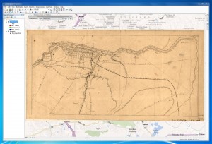
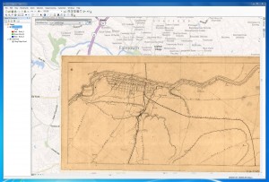
Show the static image by clicking on
Georeferencing > Fit To Display. This just plasters the map directly on top of the base layer, using the bounds of the current viewport (set in the first step) to determine the position and scale of the image. Basically, this is just setting a crude, starting starting set of geo-coordinates that can be refined by laying down point associations.
Now, the actual rectification. All this entails is creating a series of associations (at least two, as many as ~15-20) between points on the static image and points on the real-geography base layer. As you add points, ArcMap will automatically pan, rotate, scale, and ultimately “warp” the image to match the underlying base layer.
-
Lay a positioning point: I like to start by picking the most obvious, central, easy-to-find point on the historical map. In this case, I’ll use the position at which the Richmond Fredericksburg Railroad crosses over the west bank Rappahannock. To lay the first point, click on the “Add Control Points” button in the Georeferencing toolbar and click at the exact position on the historical map that you want to use as the starting point. Then, without clicking down on the map viewport again, move the cursor over to the “Table of Contents” pane and check off the historical map, leaving just the base layer visible. Then, click on the location on the base layer that corresponds to the original location on the historical map. Once you’ve clicked for a second time, the dotted line between the two clicks will disappear. Display the historical map again by checking the box next to its title in the “Table of Contents.” The image will now be anchored onto the base layer around the location of the first point association.
-
Lay a scaling and rotation point: Next, pick another easily-mappable point on the historical map, this time ideally near the edges of the image, or at least some significant distance from the first point. Follow the same steps of clicking on the historical map, hiding the historical map, clicking on the corresponding location on the base layer, and then re-enabling the historical map to see the effect.
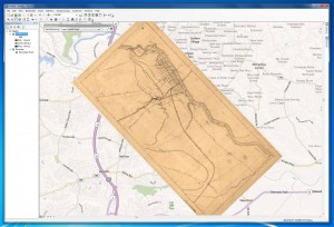
At this point, you already have a minimally rectified image – the second point will both scale the image down to roughly correct proportions and rotate the image to the correct orientation. From this point forward, adding more points will make the rectification increasingly accurate and granular by “warping” the image, like a sheet of rubber, to fit the lattice of points as accurately as possible.
How many points is enough? Really, it depends on the accuracy of the map and objectives of the Neatline exhibit. In this case, Hotchkiss’ map is already quite accurate, and the just first two points do a pretty good job of orienting the map and showing how it fits into the larger geography of the region. For literary and historical projects that don’t gain anything from extreme precision, a handful of points (2-5) is often sufficient.
When a higher level of precision is required, though, or when the historial map is significantly inaccurate (as is the case for older maps), more points (10-20) can be necessary. It’s not an exact science – just lay points until it looks right.
As you work (especially in cases where you’re laying down a lot points) experiment with different “transformation” algorithms by clicking Georeferencing > Transformations and selecting one of the five options (1st Order Polynomial, 2nd Order Polynomial, etc). Behind the scenes, these algorithms represent different computational approaches to “fitting” the image based on the set of control points – some of the transformations will leave the image roughly polygonal, whereas others will dramatically “warp” the shape of the image to make it conform more accurately to the point associations. Depending on the type of image you’re working with and its accuracy relative to the base layer, different transformations will produce more or less pleasing results. For now, I’ll just leave it at 1st Order Polynomial.
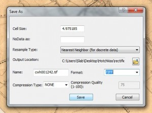
Once you’re done laying points, save off the image as a georeferenced .tiff file by clicking Georeferencing > Rectify. As desired, change the filename and target directory, and click “Save.”
Links
ArcGIS georeferencing documentation
Quantum GIS georeferencing tutorial (open-source alternative to ArcMap)
Georeferencing – making historic maps spatial
